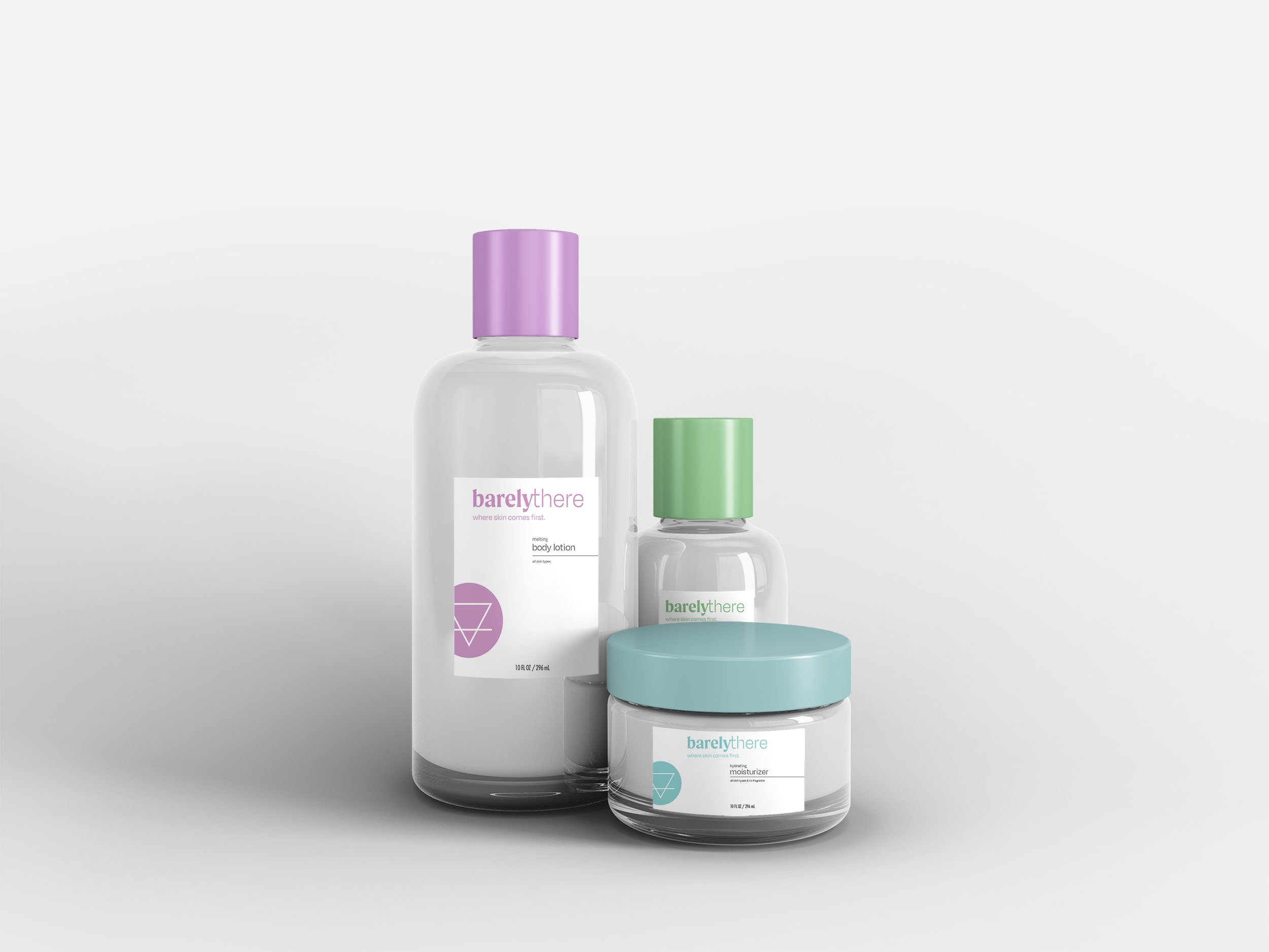
barely there: where skin comes first
Objective: Create a company product line that focuses on sustainable self care while also prioritizing the quality of the product.
Challenge: There is currently a waste crisis in the US, and landfills are quickly filling up. Non-recyclable objects don’t end up breaking down for hundred of years, if they even do at all. The self-care industry has a lot of plastic containers and packaging. Trying to use more biodegradable and recyclable objects is key to the planet’s future.
Solution: I created barely there, a self-care company focused on reusing bottles and using recyclable/biodegradable packaging. Refills are offered at a cheaper price in order to encourage people to not throw away the original bottles. All of the packaging is very minimal, and focuses on helping not only the planet, but your skin.
The Logo: The upside down triangle logo is the alchemy symbol for earth, emphasizing the focus on the planet’s health. The word mark is highly contrasted, with “barely” being bold and in-your-face, and “there” is light and thin, demonstrating the literal meaning of something being there versus not.
Information: 2021, Adobe Illustrator, Photoshop


